The Co-operators
Auto Quote & Buy

Discovery
Examining the Insurance Landscape
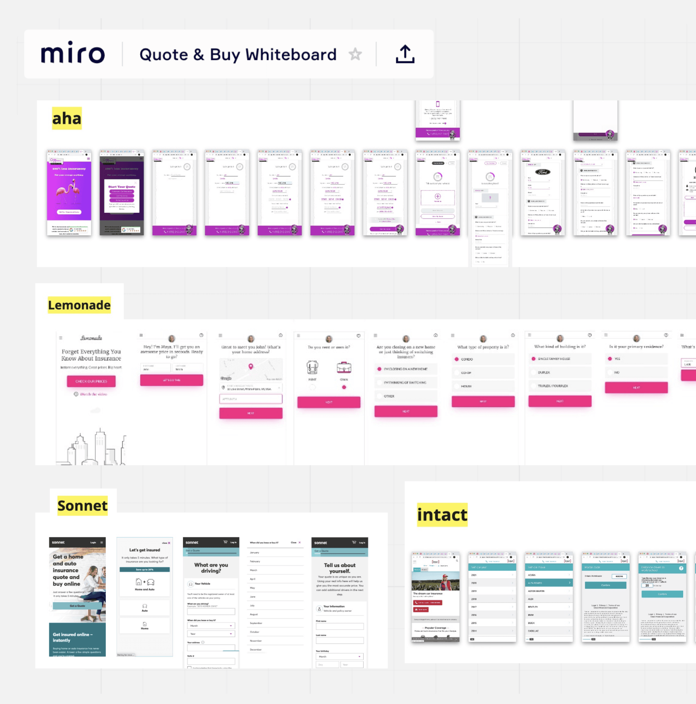
I conducted a competitive analysis to see how insurance companies used responsive web design to sell policies online. While some, like RBC and TD, used quote tools to generate leads, newer companies like Sonnet and Aha enabled direct online purchases. There was no clear industry standard, but we identified key features to improve the experience, such as upfront requirements for completing a quote. We also found issues like inaccurate time estimates and long completion times, with the fastest quotes taking 10-15 minutes.
Discovery
Project Objectives
With our analysis of the current competitive landscape concluded, we moved on to define the project goals and strategy to have a clear project vision moving forward.

Accelerate the process of getting a quote by minimizing the number of questions required to get an accurate price. This will be subject to new or revised underwriting rules.

Ensure the quote process is straightforward and easy to understand. Use a client-friendly approach when asking questions and provide additional information through help text and tool tips.

Revamp the visual language and design system to comply with accessibility standards and facilitate ease of use.
Ideation
User Task Flow
After establishing our goals and vision, we defined the user task flow to determine when to request personal and vehicle information and sensitive details like driver's license number and credit consent. While competitors asked for vehicle details first, we prioritized personal information to support future bundling of auto and home policies.
To streamline the process, we added an optional step for users to scan their driver's license to pre-populate some fields. It only became mandatory at checkout, acknowledging that not all users may feel comfortable sharing this information up-front.

Ideation
Conceptualizing & Wire-framing
We took a mobile-first approach, designing wireframes in Sketch and collaborating with product to define requirements.
For the quote flow, users needed to enter personal, driver, and vehicle details. We explored two design approaches: grouped questions vs. individual questions. Our hypothesis was that breaking questions into single steps would reduce cognitive load and make the process feel less overwhelming.

User Testing
Testing Two Concepts
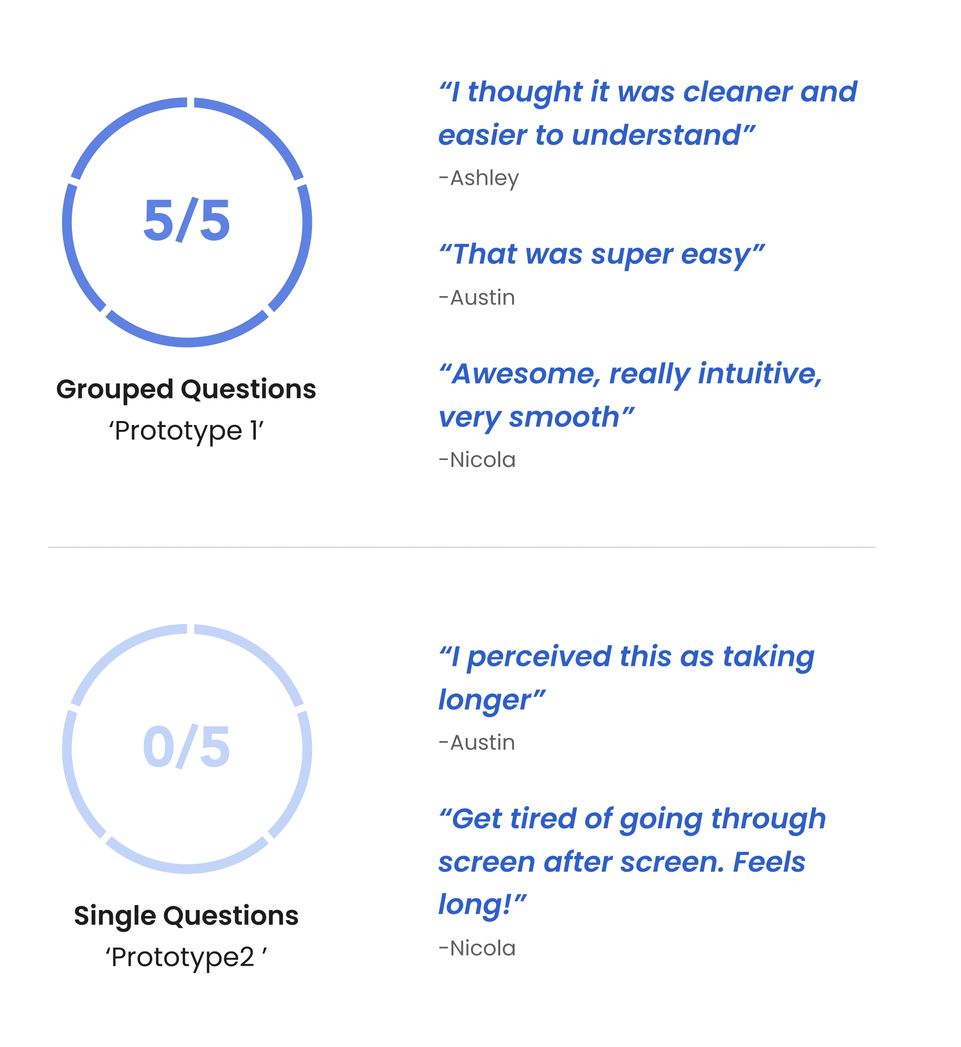
After creating mid-fidelity wireframes, I built clickable prototypes in InVision to test the two design flows—grouped questions vs. one question per page. Our goal was to determine which felt faster and easier for users while identifying pain points and opportunities for improvement based on their feedback.

User Testing
Testing Results
Iteration
Priority Revisions
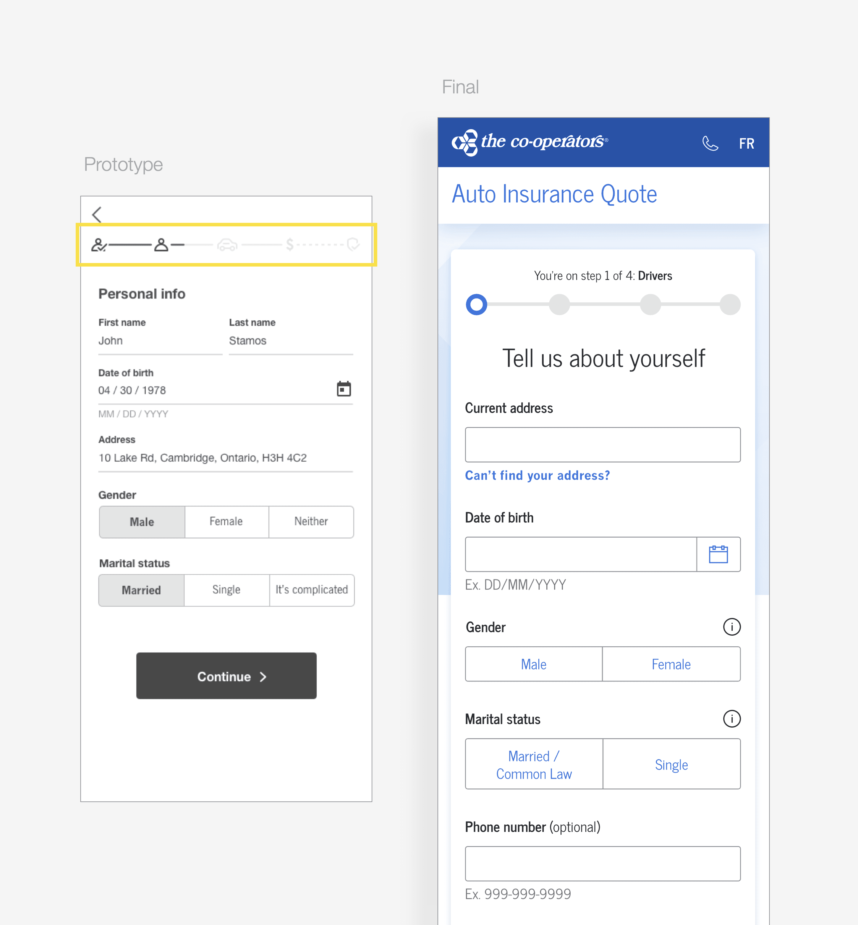
User testing revealed areas for improvement, which we addressed in the visual design phase.
Progress Bar
Driver's License Scanner
User testing showed that 80% of participants would use the driver’s license scanner to speed up the quote process. However, some hesitated to scan their license. To address this, we added clear messaging to explain its benefits and encourage adoption.

VIN Number
User testing also revealed that 40% of users were unfamiliar with VIN numbers, and some found the layout confusing, thinking they needed to enter both options instead of one. To improve clarity, we updated the layout with binary buttons and added a help modal with illustrations showing where to find the VIN.

Visual Design
Client Discovery
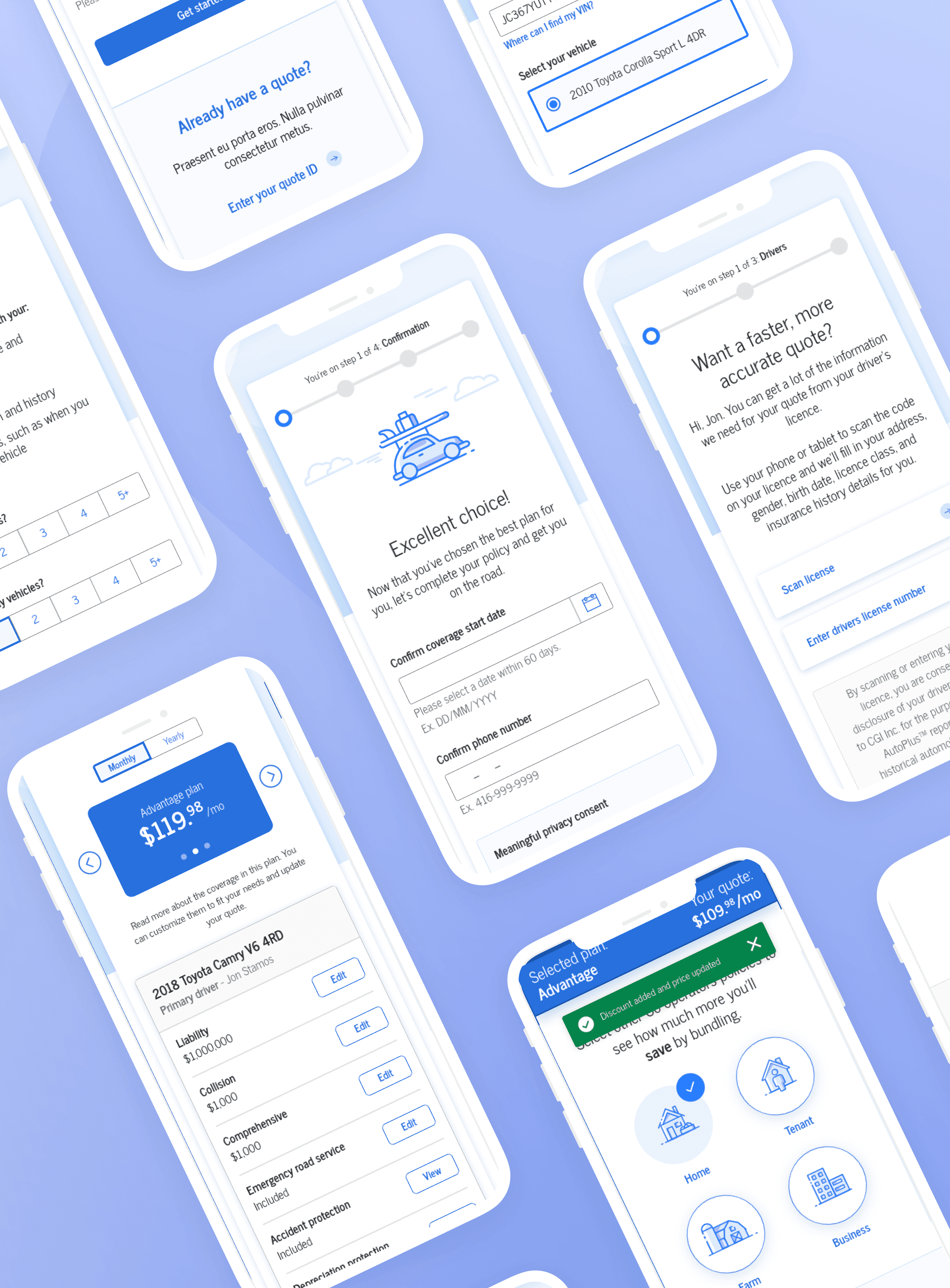
The quote flow begins with the Discovery section, where users enter personal, driver, and vehicle information. Designing this required 219 screens across desktop, tablet, and mobile, including error states and variations for multiple drivers or vehicles.


Visual Design
Quote Results Page and Plan Customization
After completing the Discovery section, users land on the Quote Results page, where they see three auto insurance plan options based on their inputs, along with eligible discounts. Users can select a plan to view its coverages and benefits or customize certain options by clicking "edit." We also designed a placeholder for bundling multiple insurance policies, planned for a future release beyond the MVP.
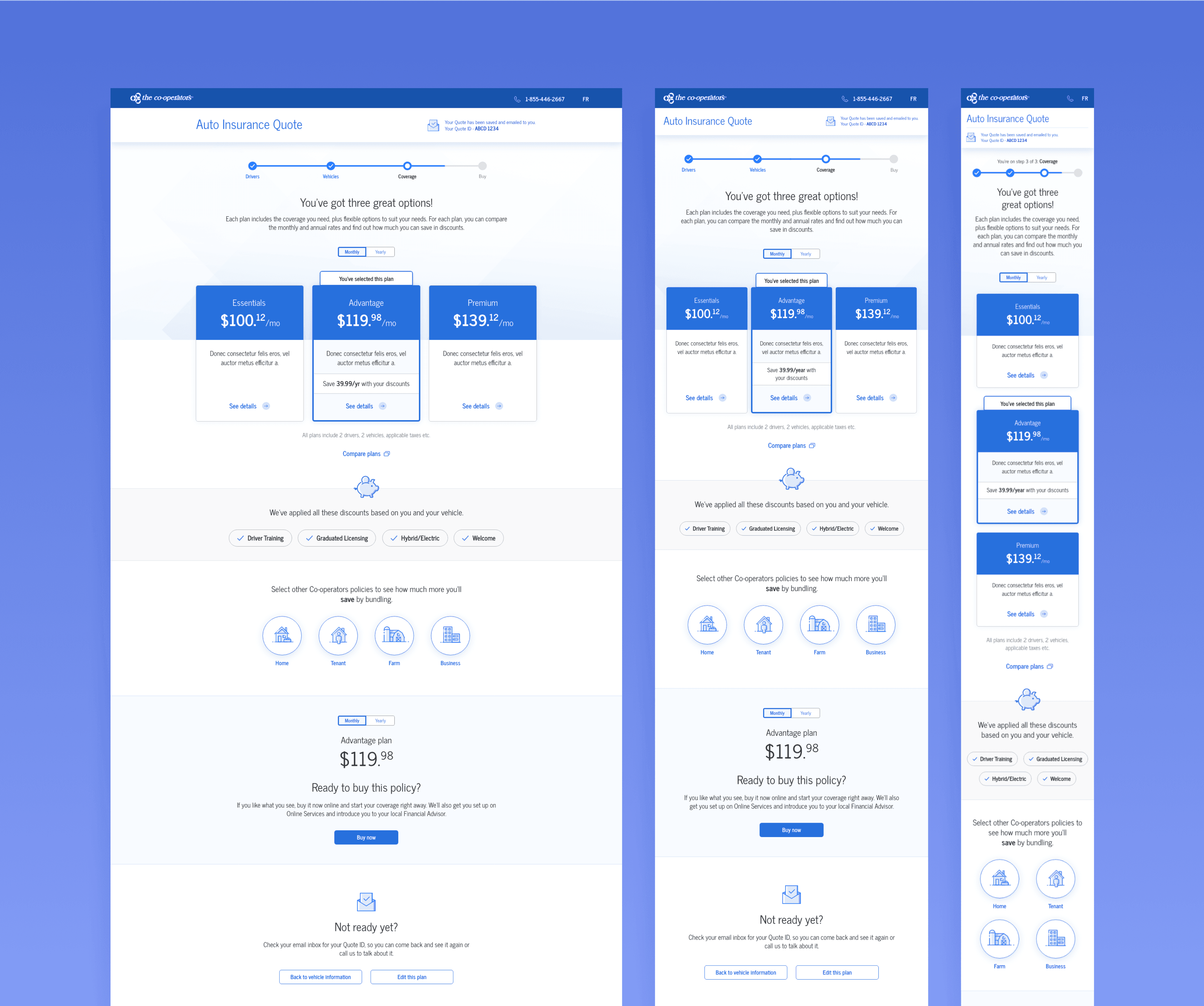
Quote Results Page

Plan Details & Customization
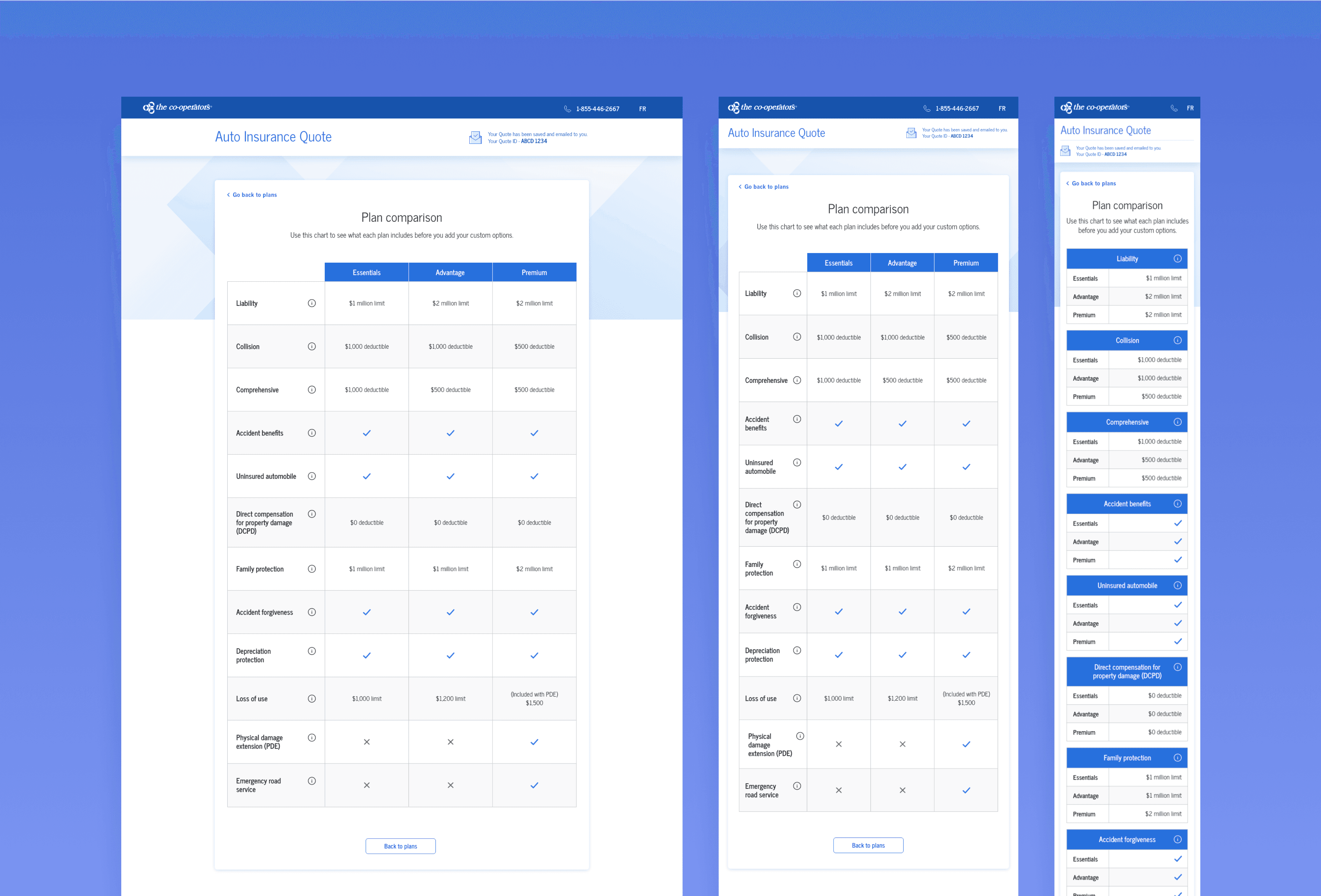
Plan Comparison
Visual Design
Onboarding & Payments
Once the user customizes their plan and is ready to purchase, they are prompted to confirm the start date of their coverage. At this stage, we capture any missing information and request payment details to complete the purchase of their selected auto insurance policy.


Visual Design
Styleguide
The redesign of the Auto Insurance Quote & Buy flow led to the creation of new components such as text fields, dropdowns, buttons, radio buttons, and checkboxes. These components formed the foundation for an updated style guide, helping the Co-operators modernize and enhance their digital platform and services.


Outcomes
We successfully delivered a comprehensive Auto Insurance Quote & Buy flow for the Co-operators, achieving a modernized UI and improved usability. Key outcomes include:
🚀
Streamlined quote experience
Reduced client discovery fields from 42 to 16 (25 without the driver's license scanner) by eliminating unnecessary questions and incorporating the driver's license scanner.
👤
Ensured the product met WCAG AA compliance for usability across all abilities.
🔮
We designed a flow and customization interface that can scale for future multi-product quotes.
Learnings
This project taught me the importance of staying flexible with tight timelines and shifting requirements. While we met our goals, I realized that more user testing—especially during the UI phase—would have been valuable. Collaborating with dev teams and accessibility experts was essential, but the challenges we faced reinforced the importance of designing with scalability in mind.