TD Bank | Easy Trade
TD Easy Trade
Design System Redesign
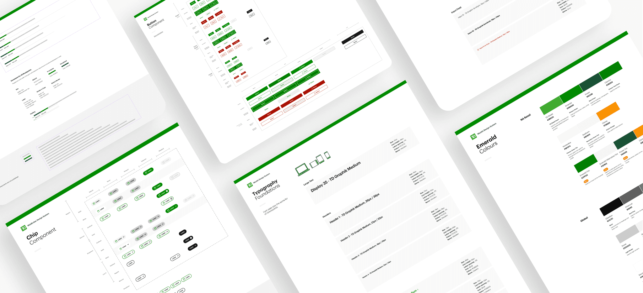
After presenting the North Star Vision for Easy Trade to stakeholders and successfully securing buy-in and budget approval for a comprehensive app redesign, we decided to start with a much needed refresh and update of the app's design system. This initiative aimed to align with TD's updated brand standards while optimizing components for a modern and mobile-friendly experience.
Background
When Easy Trade launched in 2020, TD expedited its release by adapting its desktop trading platform, WebBroker, for mobile. As a result, much of Easy Trade’s interface relied on responsive web components shared with WebBroker. This shared component library created challenges in optimizing Easy Trade’s mobile experience, as each platform served different clienteles and device requirements. To improve usability for mobile users, we needed to balance design updates carefully, ensuring we enhanced Easy Trade’s mobile experience without compromising WebBroker’s functionality for desktop users.
Both platforms shared core components.
The Strategy
After extensive discussions, our cross-functional teams concluded that Easy Trade and WebBroker’s shared components necessitated a design system update for both platforms.
I collaborated with engineering to develop a phased plan. Phase 1 focused on foundational updates—typography, spacing, and colors—followed by incremental updates to individual components.
To avoid disrupting users, we created a separate testing environment to implement and refine the new design system behind the scenes, while customers on both platforms continued to experience the legacy design system on the front end.
The plan for implementing the new design system across both platforms.
Phase 1 - Foundational Elements
Typography
One of our first updates to the design system centered on typography. With TD introducing TDGraphik as its new brand font, WebBroker and Easy Trade, which previously used Roboto, also needed to adopt this change. For Phase 1, I audited headers and body copy across both platforms to ensure a seamless, one-to-one switch to TDGraphik without disrupting readability or layout integrity.
Additionally, analytics revealed that tablet usage was minimal among Easy Trade users. Based on this data, we streamlined the font system by removing the tablet breakpoint, simplifying the design framework to include only desktop and mobile breakpoints, which better aligned with user behaviour and improved maintainability.
Transitioning typography: mapping the shift from Roboto to TDGraphik.
Phase 1 - Foundational Elements
Colours & Spacing
In Phase 1, we also focused on aligning foundational elements, like colours, with the updated brand guidelines. To ensure a smooth transition, I mapped existing colours to their new brand equivalents, similar to the approach used for updating typography.
We also optimized the spacing system by replacing the outdated 5px increment grid with a more versatile 4px grid. This adjustment enhanced the scalability of components, allowing for improved visual consistency across both Easy Trade and WebBroker.
Phase 1 - Foundational Elements
Stress Testing & QA
To validate our 1:1 mapping of foundational elements, we carefully reviewed updates to colors, typography, and spacing. We conducted quality assurance testing on high-impact areas, such as the home page and primary user flows, ensuring proper integration, functionality, and readability of the updates.
As part of the phased rollout, foundational updates were gradually pushed to the customer-facing front end while we continued refining and incrementally updating components in the testing environment to minimize user disruption.
The foundational updates.
Phase 2 - Components
Updating Components
Upon the completion of Phase 1, we transitioned into updating existing components. With the new brand guidelines at our disposal, I created a user flow for the design team, outlining how to leverage the new brand guidelines and the associated review process for component design. Once a component received the team's "done" status, it would be added to a backlog for developers to pick up as time allowed.
Process flow for designers on how to update a component.
An early example of a component update was the Buttons. To address the varying platform requirements of WebBroker and Easy Trade, I focused on optimizing button usability for mobile devices—a critical need that had previously been overlooked. This process involved researching industry benchmarks and adhering to best practices for minimum button sizes on mobile to ensure accessibility and ease of use. After evaluating multiple options, the team decided on a 46px height variant as the primary button for Easy Trade.
Another example of an early component build was the filter chips. These were prioritized due to an immediate project need, as the component did not previously exist. We began by exploring a design that could function effectively across both Easy Trade and WebBroker. Given that filter chips were integral to the North Star vision for Easy Trade, scalability for future use cases was also a key consideration.
To achieve this, we designed the component with modularity in mind, incorporating atomic elements such as iconography and dropdown functionality to support potential future requirements.
Filter chip component for WebBroker and Easy Trade.
Next Steps
The Wealth practice at TD, which includes the Easy Trade and WebBroker teams, reached a significant milestone by successfully updating the foundational design elements across both platforms. While organizational priorities have temporarily shifted, the design team remains dedicated to furthering the updated design system. This initiative continues to thrive as a passion project for the team’s designers and developers, with progress steadily advancing behind the scenes and between other projects.


