About image
TD Bank | Easy Trade

TD Easy Trade Redesign

TD Easy Trade is a mobile trading platform providing novice investors with a simple, low-barrier entry into stock trading.

I joined the Easy Trade design team in early 2022, and it was clear that the app's navigation was a significant pain point. Later that year, as TD began rolling out their new branding across different verticals, the team saw an opportunity to not only refresh the app’s visual language but also tackle its most pressing usability challenge—navigation. This redesign not only improved the immediate user experience but also established a solid foundation for the app's future evolution.

Where We Started

To expedite Easy Trade's launch in 2020, TD adapted their desktop trading platform, WebBroker, for mobile use. This led to inherent issues with the app's navigation, as it wasn't optimized for mobile.

To address these issues, I began by mapping the app's information architecture and conducting a heuristic analysis of its current state. This revealed several key barriers affecting trading and investment actions:

Cumbersome Navigation: Excessive swipes, taps, and scrolls were required to access key features and pages.

Cumbersome Navigation: Excessive swipes, taps, and scrolls were required to access key features and pages.

Limited Discovery: Users struggled to find trade ideas, with restricted search and exploration capabilities.

Limited Discovery: Users struggled to find trade ideas, with restricted search and exploration capabilities.

Lack of Real-Time Insights: Account details and performance metrics were not readily visible on the dashboard.

Lack of Real-Time Insights: Account details and performance metrics were not readily visible on the dashboard.

Not Mobile Optimized: The design system remained tethered to WebBroker’s desktop-first framework.

Not Mobile Optimized: The design system remained tethered to WebBroker’s desktop-first framework.

Outdated UI: The interface relied on TD’s older design standards, which lacked a mobile-friendly, modern aesthetic.

Outdated UI: The interface relied on TD’s older design standards, which lacked a mobile-friendly, modern aesthetic.

These insights informed our efforts to reimagine the app, laying the foundation for an improved navigation structure and user experience.

The existing IA

Easy Trade's navigation

Project Goals

The primary goal of this project was to create a validated North Star vision prototype to gain stakeholder buy-in and secure the budget for a comprehensive app redesign. To effectively present our vision and lay the groundwork for the app's future evolution, the prototype needed to demonstrate:

💸

Ease of Funding

Ease of Funding

Ease of Funding

Simplify the funding process by removing barriers and making it more intuitive and user-friendly for investors.

📱

Modernization

Modernization

Modernization

Showcase how TD's new branding could be leveraged to create a fresh, mobile-optimized visual language.

🎯

Streamlined Navigation and IA

Streamlined Navigation and IA

Streamlined Navigation and IA

Reimagine the app’s structure to ensure key features and information are easy to access, enabling faster decision-making and a more mobile-friendly user experience.

Exploration

Restructuring the IA

The legacy navigation system relied heavily on the dashboard and hamburger menu, making it cumbersome for users to access key features. To modernize the app and improve mobile usability, we decided to implement a bottom navigation bar.

After cataloging current and future app features, stakeholders and I used dot voting to prioritize what to include in the new navigation. Key selections included Transfer for quick account funding, Learn and Trade for education and stock discovery, and More to house profile settings and preferences. The Home tab served as an account overview, providing easy access to additional features, creating a more intuitive and efficient user experience.

The first iteration of the updated IA.

Exploration

Lo-fi Design Iterations

With the new IA in place, I created rapid prototypes for user testing. We conducted three rounds of moderated usability testing with existing users, gathering valuable insights from each session, which we used to make iterative improvements.

Evolution of prototypes tested with users.

Final Designs

Key Improvements

1. Bottom Nav Bar

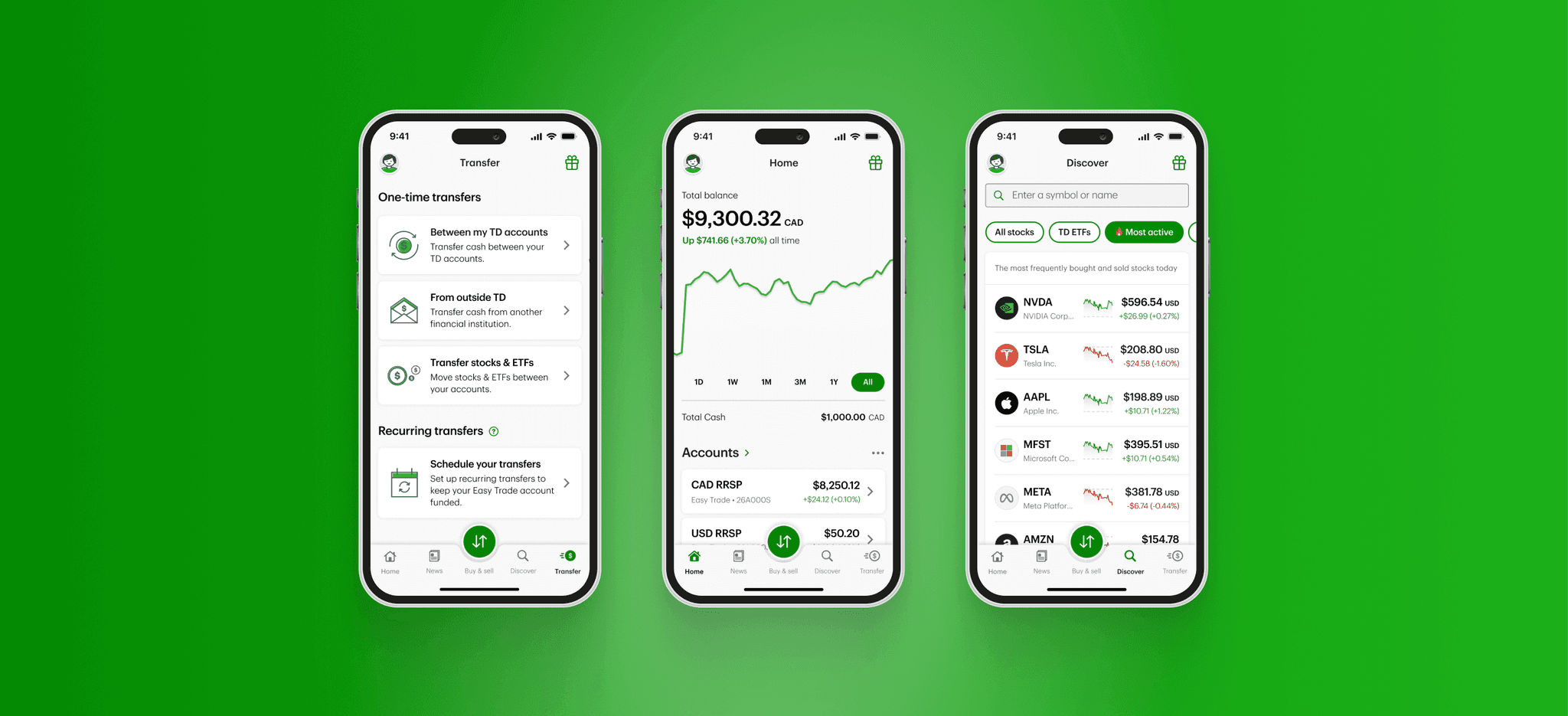
Users had previously relied on scrolling through the Dashboard or using the hamburger menu for navigation. To make the app more mobile-friendly, we introduced a bottom nav bar. Through multiple rounds of user testing, we validated our assumptions about key destinations that improved the app's ease of use. The final navigation included: Home for an overview of investments and accounts, News for market updates, Buy & Sell to open the Order Ticket, Discover for stock exploration, and Transfer for depositing and withdrawing funds.

Users had previously relied on scrolling through the Dashboard or using the hamburger menu for navigation. To make the app more mobile-friendly, we introduced a bottom nav bar. Through multiple rounds of user testing, we validated our assumptions about key destinations that improved the app's ease of use. The final navigation included: Home for an overview of investments and accounts, News for market updates, Buy & Sell to open the Order Ticket, Discover for stock exploration, and Transfer for depositing and withdrawing funds.

2. Easy Access to Accounts

Easy Trade previously lacked direct access to account information. Users had to navigate from the dashboard to their portfolio page and then select an individual account to view its performance. We streamlined this process by providing users with direct insights into their investments as soon as they open the app.

3. Emphasizing a Key Call to Action

The primary function of the app is buying and selling securities. To emphasize this, we positioned the Buy & Sell option as the main item in the nav bar. Tapping it opens the Order Ticket, providing users with easy access to trade stocks from anywhere within the app.

4. Facilitating Stock Discovery

The previous version of the app offered limited stock discovery, requiring users to already have a specific security in mind to trade. Our goal was to prioritize stock discovery and inspiration on Easy Trade. We introduced filter pills to organize and present stocks in an intuitive way, enabling users to explore and discover new securities with ease.

The Results & Next Steps

We presented the final designs to key stakeholders and the VP of Wealth at TD, receiving positive feedback and generating excitement about the potential enhancements to Easy Trade. This exploration successfully secured stakeholder buy-in to move forward with the app's update. As a first step, we are completely overhauling the design system, starting with the grid, fonts, and colors to modernize the app.

Check out my next project, where I showcase how we are revamping Easy Trade’s design system.

User tested and validated prototype

User tested and validated prototype

🤝

Stakeholder buy-in and budget

Stakeholder buy-in and budget

Exploration of Easy Trade in dark mode.